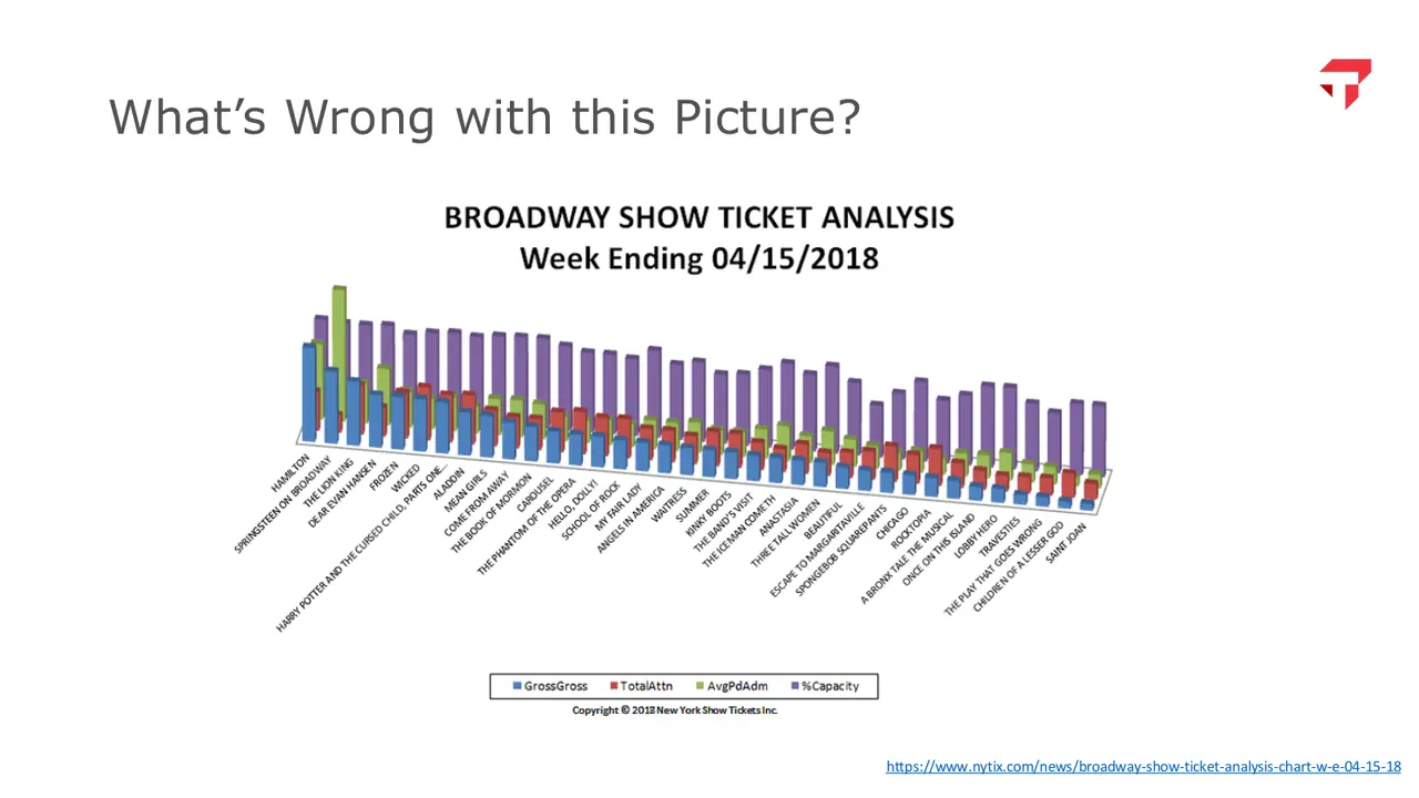
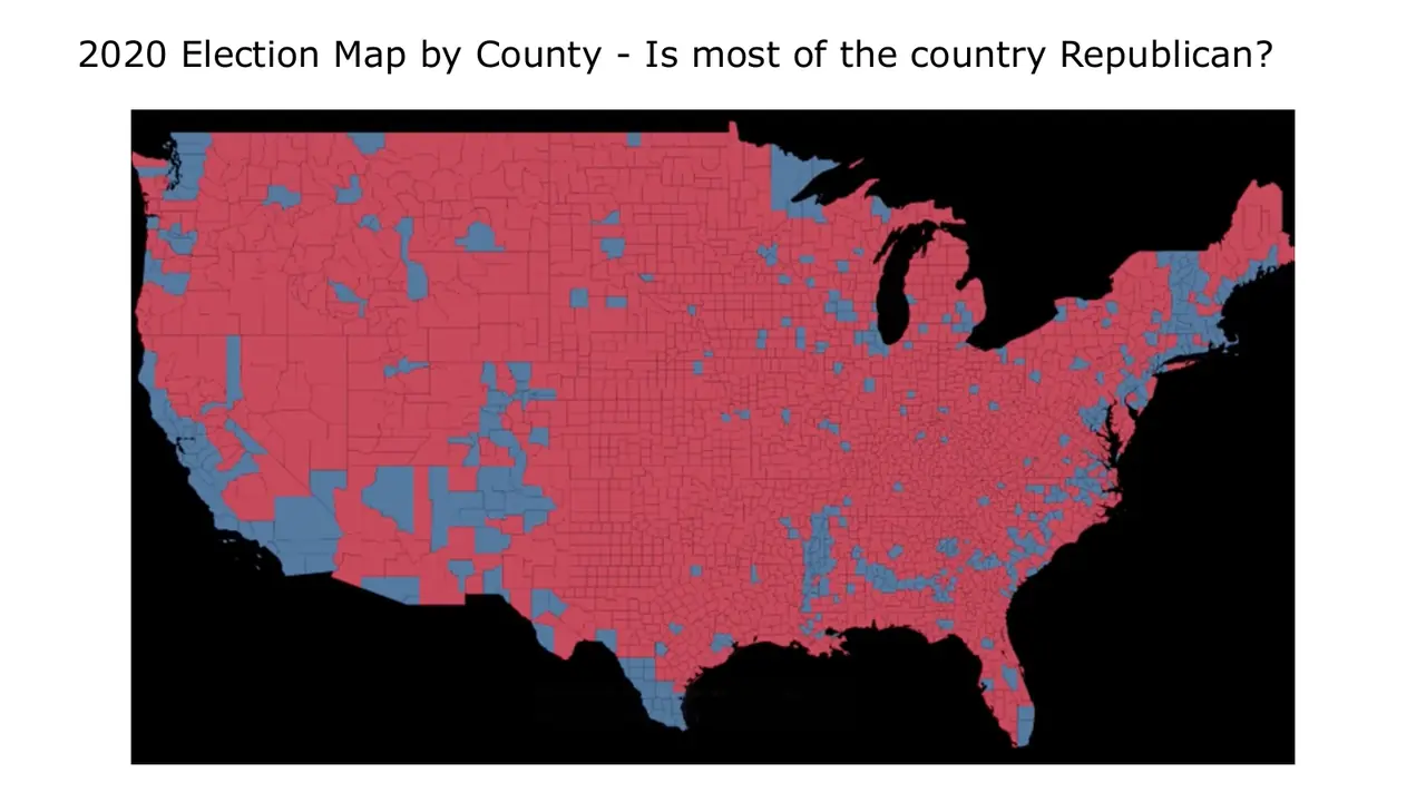
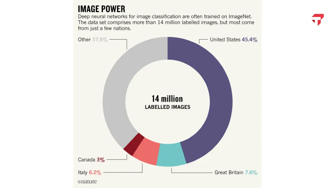
Charts and dashboards designed to change a decision.
A Tableau course for MBA students on designing charts and dashboards for executives, and on spotting graphics that mislead. Students design charts and dashboards for executive audiences, and they learn enough about perception and statistics to spot a graphic that misleads.
Spring 2026, Mini 3
Mondays and Wednesdays
Course number 45-885
slides from the decks I taught from
No. 02
Spring 2026, Mini 3 · Mondays and Wednesdays
Week by week
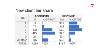
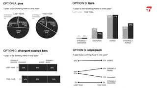
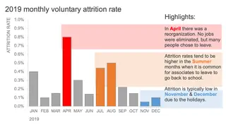
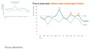
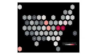
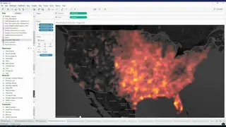
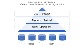
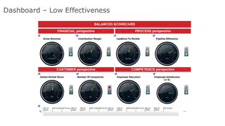
Scroll the schedule and the slides follow along: five from each session, picked from the decks I taught from.
M1Course overview and design of visual information5 slides
M1Tableau Desktop fundamentalsIn-class exercise
M2No class: Martin Luther King Jr. DayNo class
M2Storytelling with data5 slidesLab 1 due
M3Principles of visual design5 slides
M3Data visualization in TableauIn-class exercise
M4Typography, color, and computation for data visualization5 slidesLab 2 due
M4Calculations in TableauIn-class exercise
M5Visualizing spatial data5 slidesLab 3 due
M5Visualizing spatial dataIn-class exercise
M6Dashboards and interactive displays5 slidesLab 4 due
M6Dashboards and interactive displaysIn-class exercise
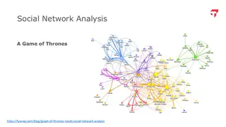
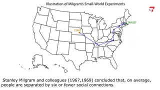
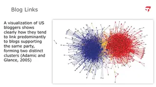
M7Clustering and social network graphs5 slidesFinal project proposal due
M7Explainable AI, data preparation, and visual animation5 slidesFinal project due March 1
No. 03
Method
How the course works
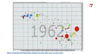
No programming is required. Students start as Tableau beginners and finish with calculated fields, parameters, maps, interactive dashboards, and animation. Along the way they rebuild Hans Rosling's Gapminder bubble chart from raw World Bank tables.
Every class opens with a team critiquing a data story published in the last six months, in the Financial Times, the Wall Street Journal, The Economist, or ProPublica, and remaking two or three of its charts. Before presenting, teams test their redesign with an AI Data Visualization Coach, a custom GPT I built with my colleague Zoey Jiang. It will not hand over a redesign. It questions the team from three seats: a journalist, a chart designer, and a business stakeholder.
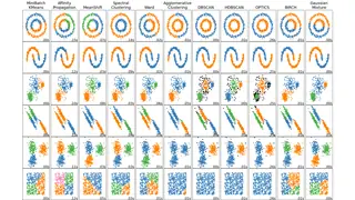
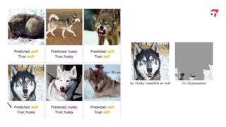
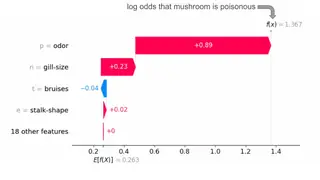
After dashboards, the course covers clustering, network graphs, and explainable AI, so students can chart what a model found and why.
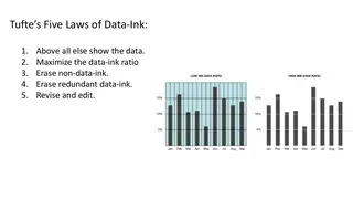
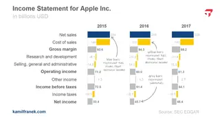
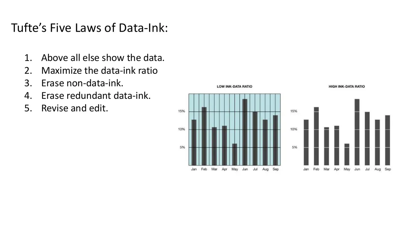
fig. 1 · Tufte's five laws of data-ink, with a low and a high data-ink bar chart
No. 04
What students hand in
Major assignments
Final visualization project30%
Labs40%
Data story analysis10%
Class participation20%
fig. 2 · weight of each major assignment in the grade
Final visualization project30%
Individually or in pairs, students answer their own business question or take one of two set datasets (daily city temperatures or the Netflix catalog). They hand in a Tableau workbook with an interactive dashboard, the cleaned data, and a 5 to 7 minute recorded video that tells the story. A one to two page proposal comes due in the last module.
Data story analysis10%
Once in the term, a small team opens class with a data story published in the last six months, critiques two or three of its charts with principles from the course, and presents remade versions. Before presenting, teams test the redesign with the AI Data Visualization Coach.
Class participation20%
Credit in each of the seven modules for in-class quizzes, Tableau workbooks submitted from the lab sessions, or follow-along activities.
Labs 40%four labs
Lab 1
Design of visual information
No software yet. Students critique and redesign weak charts, including two published charts claiming college no longer pays off, then critique and redo a chart they made themselves before the course.
Lab 2
Data visualization with Tableau
With a DonorsChoose extract where each row is a donation, students sort measures from dimensions, build a dual-axis chart of donations by grade level, write a students-reached-per-dollar calculated field, map donations by state, add a moving average, and report one insight of their own.
Lab 3
Calculations in Tableau
Using avocado sales data, students build table calculations such as percent of total by market and FIXED and EXCLUDE level of detail expressions, and explain how filters interact with them.
Lab 4
Visualizing spatial data
Did Austin's 2015 Uber ban hurt demand for Airbnb listings that are harder to reach? Students map transit and walk scores, map the change in demand from 2015 to 2016, and cluster listings by location in Tableau.
No. 05
What students built
Final projects
The final project is a Tableau workbook with an interactive dashboard and a recorded video that tells its story. Students choose their own question or one of two public datasets. Projects from Spring 2024 and Spring 2025, grouped by type, with one example each.
Netflix content strategyWhere Netflix's catalog grew, country by country10
Public sector, policy, and societyNeighborhood income change by zip code in a US metro10
Economics, labor, and pricesWhy eggs got expensive: 50 years of food prices5
Business performance dashboardsDoes discounting drive profit? An executive retail dashboard5
Media and the creator economyWhat drives YouTube creator revenue?4
Climate and environment25 years of warming, city by city4
SportsDoes payroll buy wins in baseball?2
Consumer productsDo electric cars deliver their certified range?2
fig. 3 · projects by type, with one example each
Every project, by term.
Spring 202523 projects
Netflix content by country and genre. Compared TV vs. movie output and genre mix across countries; selecting a country (e.g., UK) showed movies dominating over time, with a 2019-2020 dip attributed to the pandemic. Kaggle Netflix titles; Tableau Prep split/pivot of multi-country field, genre grouping; treemap country selector driving line charts
Neighborhood income change by zip code. Mapped how median household income shifted by zip code (zooming into Pittsburgh) to raise questions about gentrification and local disparities. Census ACS median income; calculated percent-change fields; filled maps, heat-map coloring, linked table with click-to-filter
Netflix TV vs. movies and kids content. Explored how Netflix's TV/movie mix and children's content shifted over time and where content originates (US, India, UK dominant). Kaggle Netflix titles; genres regrouped; bar, line, stacked bar charts and a geospatial map with an interactive bar chart
YouTube channel revenue drivers. Asked which factors drive creator revenue; trend lines and binned views showed which metrics correlate with revenue, with subscribers as the second most important factor. YouTube dataset with sparse columns removed; binned metrics, scatter plots with trend lines, text tables, dashboard filters
Racial disparities in Nashville traffic stops. Compared stop rates and outcomes (warnings, citations, arrests) by race against Nashville census demographics and tracked declines in stops alongside a 2014 Tennessee bill. Stanford Open Policing Project data filtered to 2011-2018; demographic charts, stop-density map, day/hour views, year filter and race highlighting
MLB payroll vs. wins. Showed diminishing returns to payroll, flagging the Yankees as least and the Rays/Pirates as most cost-efficient per win, with COVID-season adjustments. Baseball Reference wins blended with Spotrac payroll; bar-line combo, scatter with efficiency line, heat map, cost-per-win table; team selector across views
NYC subway ridership recovery after COVID. Compared post- vs. pre-COVID ridership (about 75% recovery headline), rush-hour vs. off-peak shifts, and station-level outliers, linking changes to hybrid work and tourism. MTA turnstile data; line and area charts, station map sized/colored by ridership and recovery, click/hover filtering
U.S. defense procurement spending. Tracked total procurement, branch allocations (including the new Space Force), category growth in software and cyber, and top contractors' market share. DoD Green Book, SIPRI, and contract-award data reshaped to long format in constant FY25 dollars; line, stacked area, and bar charts with year/branch/category filters
Recycling trends for circular products. Identified materials (paper, iron-based metals) with enough recycled volume to support circular product development, contrasting declines such as newspapers. U.S. EPA waste-stream data; time series and bar charts, parameter-driven threshold sliders, year and goods-type filters with some views held unfiltered
Gender gaps in STEM education. Contrasted girls' academic performance with lower STEM enrollment, mapped education spending, and related government spending to gender parity, ending with policy calls to action. World Bank indicators on education spending, STEM enrollment, and gender parity (GPI), merged and cleaned; choropleth, line, bar, scatter; calculated field estimating female STEM graduates
Nurse staffing cost savings in Canadian healthcare. A what-if dashboard comparing the cost of filling nursing shifts directly against staffing agencies. Published staffing-shortage and agency-fee figures; parameter inputs for nurses, days, and shifts; side-by-side cost comparison
Marvel films and comics. Paired MCU revenue/profit trends with new comic character introductions to suggest which emerging heroes could anchor future films. MCU box office (2008-2019) plus Marvel comics character data, outliers filtered and missing values recoded; split-view dashboard with year-range and hero-gender filters
Netflix content production trends. Examined movies vs. TV, leading countries, genres and directors, COVID effects on additions, and older-title licensing, closing with content-strategy recommendations. Kaggle Netflix titles with multi-value fields split, outliers removed, genres grouped; seasonality, global distribution, release-vs-added charts; date and genre filters
Where disabled veterans live. Found disproportionate concentrations of disabled veterans in Southern states (e.g., Georgia) relative to total veteran counts and tied this to VA resource allocation. VA disability data merged with USDA county statistics and census data; maps, scatterplot with adjustable scale, top/bottom-10 sorted bars, state filter
Super Bowl prediction myth-busting. Used offense, defense, and special-teams data to argue the Eagles were underrated relative to near-unanimous media picks for the Chiefs. NFL regular-season team, quarterback, and Super Bowl stats from multiple sources; scatter plots, treemaps, bubble charts, summary tiles, conference/division filters
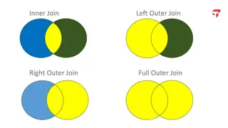
Supply-chain order analysis for a quotations team. Answered a sales team's questions about order sizes, product lines, and shipping routes. Sales and vendor data joined in Tableau; custom bins, treemap, log-scale dual-axis chart, route map, KPI ribbon
Executive dashboards for a retail superstore. Built separate CEO, CMO, and COO dashboards with role-specific KPIs such as forecasts, discount-profit relationships, and shipping modes. Kaggle Superstore data; calculated YoY metrics, forecasting, top/bottom-N lists, filters by year/region/category
Netflix catalog strategy. Showed rapid catalog growth after 2017, top genres and producing countries, and typical movie runtimes, recommending more family and localized content. Kaggle Netflix titles with manual cleaning of multi-country and duration fields; bar charts, trend lines, map; filters by type, rating, country
Global warming by region and season. Showed which regions and months warmed most, contrasting slightly warmer winters with hotter summers and linking to agriculture (e.g., Florida crops). Kaggle daily city temperatures (1995-2019), incomplete years excluded; slope graphs, time-lapse map, monthly seasonal breakdowns with region/country filters
Netflix international content strategy. Framed a content-strategy decision showing mature-rated content dominance in the US vs. other markets and Bollywood's weight in India, recommending more focus on India. Kaggle Netflix titles; regional genre and rating views with region/country/genre drill-down
Road roughness and traffic accidents. Found road roughness was not the primary accident driver, with 'other road users' the dominant cause, and discussed implications for transportation planning. National Transportation Atlas Database incl. International Roughness Index; maps plus bar charts with clickable state and road-type filters
Netflix global expansion. Traced Netflix's international expansion, including investment-driven production spikes in India and a TV focus in Japan. Kaggle Netflix titles with expanded multi-country records and manually curated location data; geospatial map with movie/TV and country comparisons
Federal student loans and interest rates. Showed a negative relationship between interest rates and loan disbursements and framed the dashboard as a forecasting tool for universities' enrollment and budgets. U.S. Dept. of Education loan data blended with Census population; per-capita normalization, interest-rate averages, state map selector vs. national average
Spring 202414 projects
Netflix TV shows vs. movies. Argued TV shows are growing globally and correlated TV share with operating income, claiming TV is more efficient per title than movies. netflix_titles.csv plus Netflix 2023 engagement report and 10-K data; country comparisons and a correlation analysis
Global food trends and restaurants. Showed food inflation reducing restaurant share of wallet and younger consumers moving to healthier options, with suggestions for how restaurants adapt. Credited external datasets on food inflation and consumer preferences; trend visuals
Global terrorism 1990-2020. Showed terrorism spiked then recently dropped, that the Iraq/Afghanistan wars drove much of the count, and that attacks are not confined to one region. Three decades of attack data; totals, country maps, and attacks by organization
Garment factory productivity and incentives. Found higher incentives associated with lower productivity for some teams and recommended restructuring the incentive program. Garment factory productivity data (actual vs. targeted, overtime, incentives) by department and team
Global warming. Compared 1995 and 2019 averages and regional variability to show gradual warming, with some recent regional declines. Daily city temperature data (predefined climate project); heat maps, line graphs, box plots
Spotify revenue and Premium. Traced revenue and gross profit growth and compared Premium vs. ad revenue around a 2022 change. Spotify financials, subscriber and ARPU metrics; revenue/profit trend charts
EV certified vs. actual range in South Korea. Showed actual ranges often exceed certified ones with wide variation by manufacturer and weight class, with suggestions for the regulator. Public test results from a YouTube channel's standardized route vs. Ministry of Environment certified ranges; ratio by brand and weight class
Netflix content strategy. Showed library growth slowing after 2019 amid streaming competition, faster movie than TV growth, and duration patterns across top countries. Kaggle Netflix titles; library growth and average duration by country of production
High-growth careers. Identified occupations with high projected growth and low automation risk to guide students' career choices. Occupational employment change and projection data, automation potential, education requirements
Netflix originals and MPAA ratings. Argued that few Netflix originals are rated PG or below and proposed steps on ratings strategy. Market data on Netflix expansion, original-content investment, Disney+ ad revenue, PG-13 box office share
Formula 1 greats of the decade. Compared Hamilton and Verstappen to name the recent 'G.O.A.T.', with context on regulation changes. A decade of F1 results; wins and pole positions by driver and circuit
NYC restaurant inspections. Found steady average scores, more A grades in Manhattan, and a slight rise in bio-hazard violations. NYC Open Data (Dept. of Health) inspection records, 2021-2023; trend, borough grade distribution, violation trends
Capital vs. labor productivity and GDP. Asked how capital and labor productivity relate to GDP and attributed sustained U.S. productivity to investment in education and technology. World Bank capital stock and real GDP data; comparisons of the U.S., China, and Nigeria
Watch company simulation operations. Told the story of the team's simulated company's global market share, financial performance, and capital structure versus competitors. Data from a 12-period MBA capstone business simulation, visualized in Tableau; world map of market share, revenue/ROIC bars, capital structure
No. 06
In their words
What students say
4.78 out of 5 average teaching rating · 6 sections · 192 student responses · all evaluations
One of the most practical classes I've taken at Tepper, I actually learned something I could take to work today and use.
Spring 2025
This was truly the best class I have had at Tepper. No other class has been as good as this.
Fall 2025
It feels like you're discovering together what are good and bad practices. The format forces you to think and judge before learning best practices.
Spring 2026
He made everything idiot proof and really met people where they were at. He is so knowledgeable & cool. 10/10
Spring 2026
He is a great teacher, very patient, helpful and understanding of different perspectives.
Spring 2025
No. 07
Revision history
How the course developed
I took over Data Visualization in Spring 2024 with an evening section. At the time the course mixed Tableau with R and ggplot2. Since Spring 2025 it has been a Tableau course that needs no programming, and for the online hybrid students I recorded a library of about fifty short screencast lessons.
In Fall 2025 I split each week into a lecture and a lab and gave visual design, typography, and color sessions of their own. The final project is a recorded data story of five to seven minutes.
Offerings
Spring 2024 evening
Spring 2025 full-time
Spring 2025 online hybrid
Fall 2025 full-time
Spring 2026 full-time
Spring 2026 online hybrid
Enrolled students get the Tableau workbooks and screencast lessons on Canvas.
I also teach versions of this material to company teams, using their own data. Custom education