
Ben Collier, PhD Book a call →free, 15 minutes

Tepper · MS in Business Analytics

Data Exploration and Visualization

We spend half the time hands-on with applied tools and half learning to tell stories with data: chart design, dashboards, and visualization for machine learning.

The MS in Business Analytics counterpart to the MBA course Data Visualization: seven weekly modules in Tableau, with the same labs, weekly data stories, and AI coach as the MBA course, ending on explainable AI and visualization for machine learning.

  • Spring 2026, Mini 3
  • Once a week, mostly Mondays
  • Course number 46-885
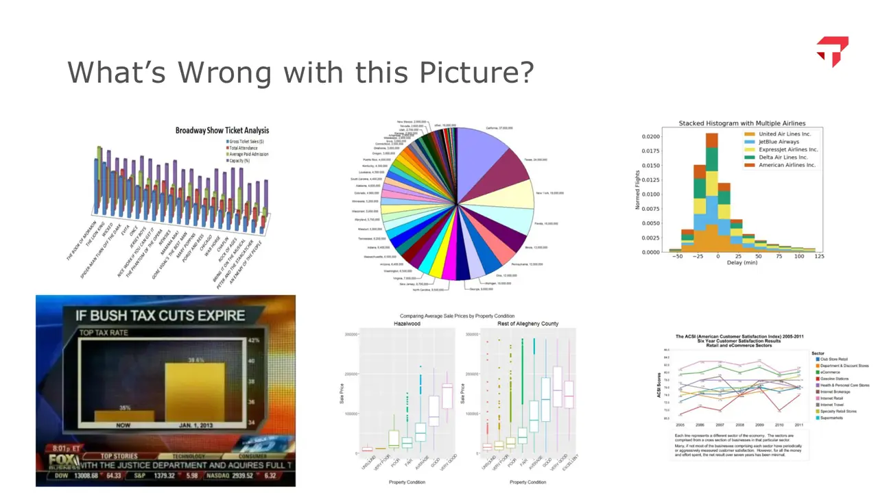
Slide: What's wrong with this picture? Pies, 3D, and clutter
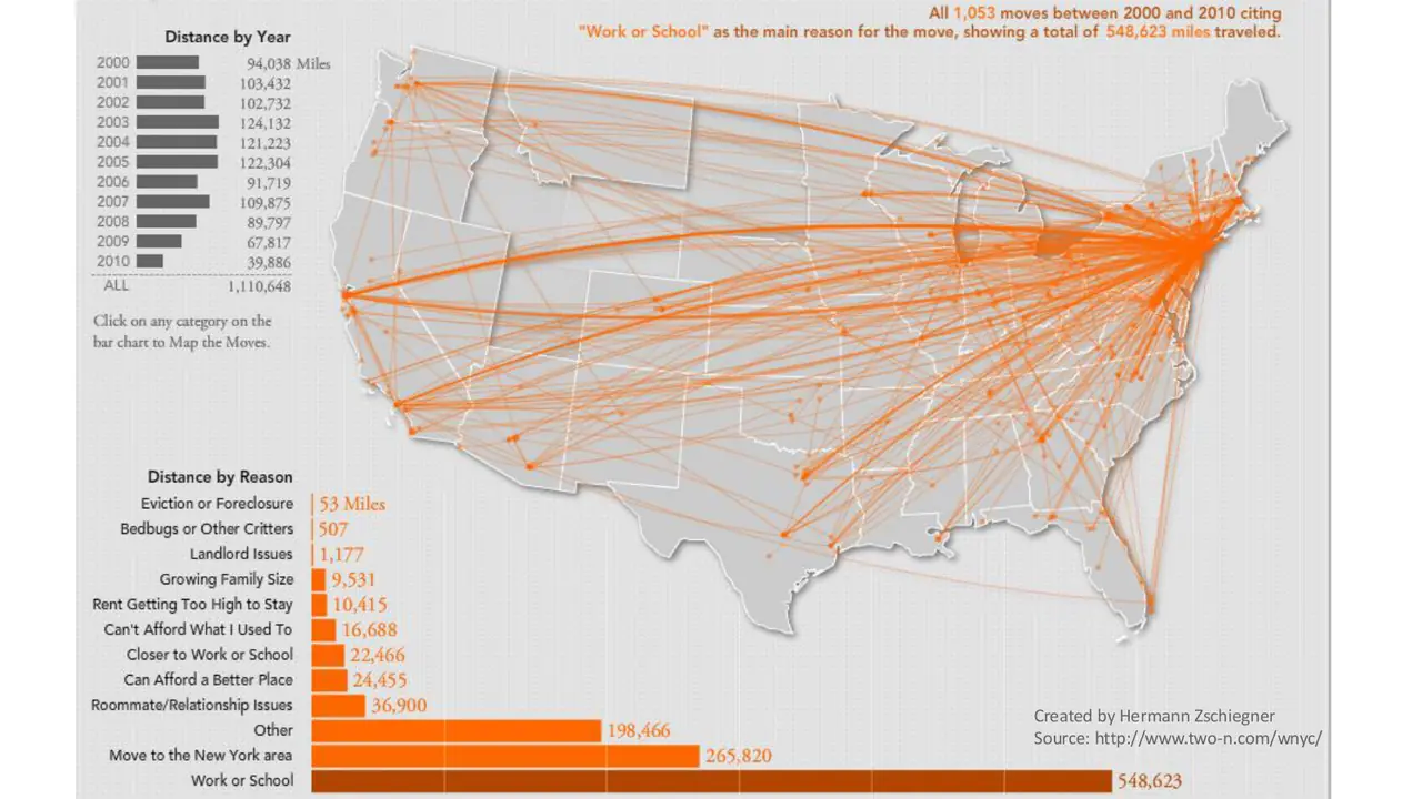
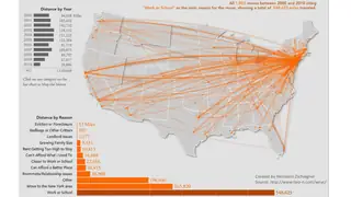
Slide: Flow map of 1,053 moves made for work or school, 2000 to 2010
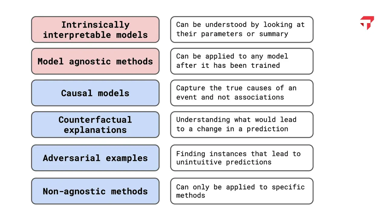
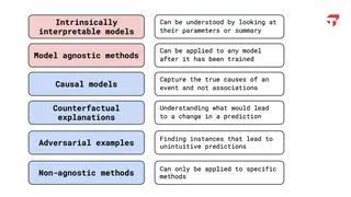
Slide: A map of explainable AI methods, from interpretable models to adversarial examples

slides from the decks
I taught from

Spring 2026, Mini 3 · Once a week, mostly Mondays

Week by week

Scroll the schedule and the slides follow along: five from each session, picked from the decks I taught from.

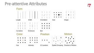
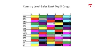
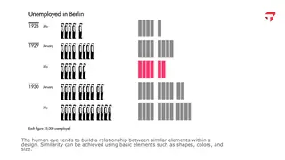
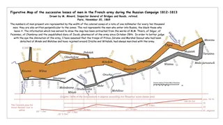
  1. M1Course overview, design of visual information, and Tableau Desktop fundamentalsWhat's wrong with this picture? Pies, 3D, and clutterPre-attentive attributes: form, color, position, and motionCountry sales ranks for five drugs, colored until nothing stands outSimilarity: unemployment in Berlin, 1928 to 1930, one figure per 25,000 peopleMinard's map of Napoleon's 1812 Russian campaign, redrawn in color
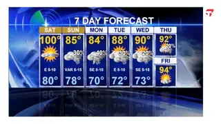
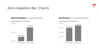
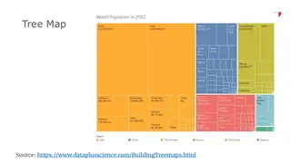
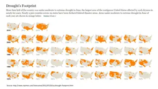
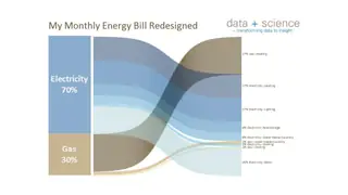
  2. M2Storytelling with data, and data visualization in TableauLab 1 dueA seven-day forecast with every number competing for attentionObamacare enrollment with and without a zero baselineTree map of world population in 2012, grouped by regionSmall multiples: decades of US drought in June, from the New York TimesA monthly energy bill redesigned as a Sankey diagram
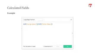
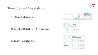
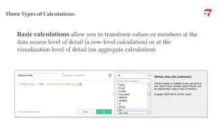
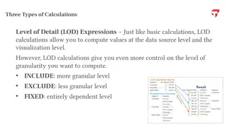
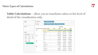
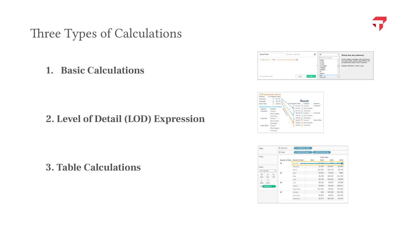
  3. M3Calculations, parameters, aggregations, predictions, and trends in TableauLab 2 dueA calculated field in Tableau's editorThree types of calculation: basic, level of detail, and tableBasic calculations work row by row or on aggregatesLevel of detail expressions: INCLUDE, EXCLUDE, and FIXEDTable calculations transform values at the level of the view
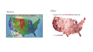
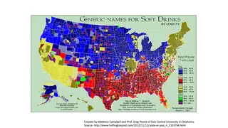
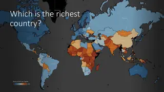
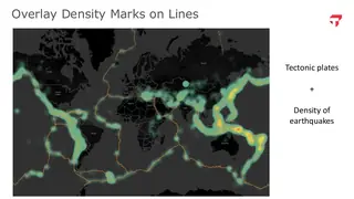
  4. M4Visualizing spatial dataLab 3 dueRemove to improve: the anti-bacon map before and afterPop, soda, or coke? Generic soft drink names by countyFlow map of 1,053 moves made for work or school, 2000 to 2010Which is the richest country? A world map of GDP per capita rankEarthquake density laid over tectonic plate lines
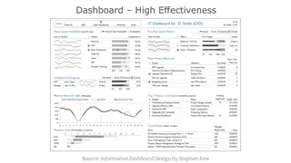
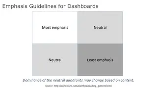
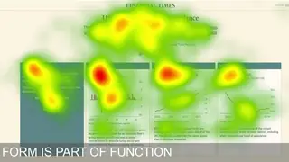
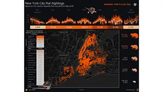
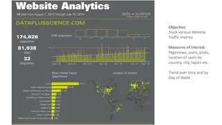
  5. M5Dashboards and interactive displaysLab 4 dueHigh effectiveness: a dense CIO dashboard that still reads cleanlyEmphasis guidelines: which quadrant of a dashboard the eye finds firstEye-tracking heat map: form is part of functionNew York City rat sightings as a dark-themed dashboardA website analytics dashboard with the key numbers up top
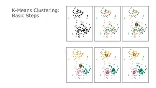
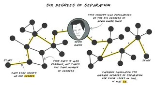
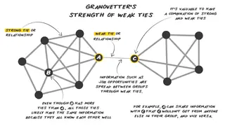
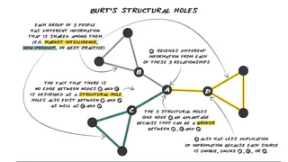
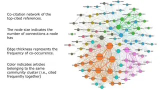
  6. M6Clustering and social network graphsFinal project proposal dueK-means, step by step: assign points, move the centroids, repeatSix degrees of separation, drawn as a networkGranovetter's strength of weak tiesBurt's structural holes: brokers who bridge separate groupsA co-citation network: node size for connections, color for community
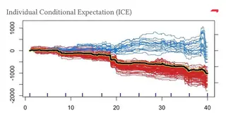
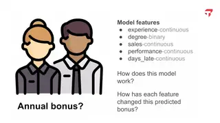
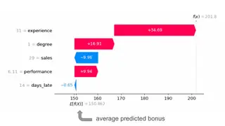
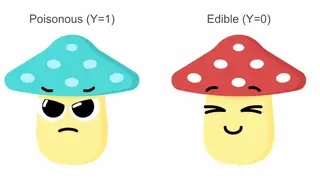
  7. M7Explainable AI and data visualization for machine learningFinal project due March 1A map of explainable AI methods, from interpretable models to adversarial examplesIndividual conditional expectation curves behind a partial dependence plotThe explainability question: how did each feature change this predicted bonus?A SHAP waterfall: experience, degree, and sales build up one predicted bonusPoisonous or edible? Setting up a SHAP example with mushrooms

Method

How the course works

Students use the same labs, weekly data stories, and AI coach as the MBA sections. The last module covers explainable AI and visualization for machine learning, so the course ends where their machine learning courses begin.

Three types of calculation: basic, level of detail, and table
fig. 1 · Three types of calculation: basic, level of detail, and table

What students hand in

Major assignments

  • Final visualization project30%
  • Labs40%
  • Data story analysis10%
  • Class participation20%
fig. 2 · weight of each major assignment in the grade

Final visualization project 30%

Individually or in pairs, students answer their own business question or take one of two set datasets (daily city temperatures or the Netflix catalog). They hand in a Tableau workbook with an interactive dashboard, the cleaned data, and a 5 to 7 minute recorded video that tells the story. A one to two page proposal comes due in the last module.

Data story analysis 10%

Once in the term, a small team opens class with a data story published in the last six months, critiques two or three of its charts with principles from the course, and presents remade versions. Before presenting, teams test the redesign with the AI Data Visualization Coach.

Class participation 20%

Credit in each of the seven modules for in-class quizzes, Tableau workbooks submitted from the lab sessions, or follow-along activities.

Labs 40% four labs

Lab 1

Design of visual information

No software yet. Students critique and redesign weak charts, including two published charts claiming college no longer pays off, then critique and redo a chart they made themselves before the course.

Lab 2

Data visualization with Tableau

With a DonorsChoose extract where each row is a donation, students sort measures from dimensions, build a dual-axis chart of donations by grade level, write a students-reached-per-dollar calculated field, map donations by state, add a moving average, and report one insight of their own.

Lab 3

Calculations in Tableau

Using avocado sales data, students build table calculations such as percent of total by market and FIXED and EXCLUDE level of detail expressions, and explain how filters interact with them.

Lab 4

Visualizing spatial data

Did Austin's 2015 Uber ban hurt demand for Airbnb listings that are harder to reach? Students map transit and walk scores, map the change in demand from 2015 to 2016, and cluster listings by location in Tableau.

What students built

Student work

Every project, by term.

Spring 2025 2 projects
  • Kickstarter campaign success. Showed shifting success rates and funding goals by country and category, used clustering to separate high-risk from popular projects, and addressed where to launch a campaign. Kickstarter data normalized with population data; time-based animation, clustering, category/subcategory drill-down
  • AWS software sales performance. Found higher discounts did not raise profit, revealed seasonal sales spikes, and highlighted Asia's high volume with negative profit. Software sales data (profit, discount, region) with outliers excluded; scatter, treemap, bar, map, moving average, Top-N parameter, current vs. prior-year KPI cards

In their words

What students say

4.91 out of 5 average teaching rating · 2 sections · 45 student responses · all evaluations

Have already convinced my work to purchase the software for me and I am using it at work now.

Spring 2025

Professor Collier is one of the most passionate professors I've come across!

Spring 2025

The professor's undeniable enthusiasm for the topics he was sharing, whether it was experiments or fonts!

Spring 2025

Revision history

How the course developed

I first taught it in Spring 2025 and again in Spring 2026, with one session a week. It follows the MBA online hybrid syllabus module for module, with typography and color folded into the design sessions, and ends with the same recorded data story.

Offerings

  • Spring 2025 online hybrid
  • Spring 2026

Enrolled students get the workbooks and lessons on Canvas.

All courses